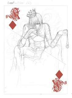
This is Hizumi, he's the vocals and he wears Garnet Style.

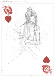
Annd Tsukasa is the queen (because he's the prettiest! yay!) and he's the drummer. He's wears White Style

ZERO is the jack and he wears the style for [Coll:set] and he's bass.

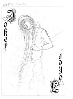
Karyu's silly and the guitarist and he wears the style for Liquidize, which would be the spade suit because i needed one.

the ace of spades. I couldn't just pick one of the band members because that would be unfair. So i used their name in a neat font. I'm gonna hand letter it later in a similar style...

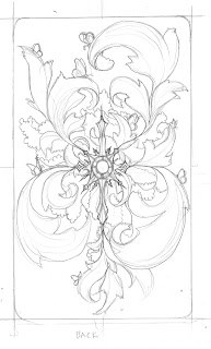
annd the back. its gonna have a chain-link fence in the back for texture. And i dont have a number card yet. I'm still thinking on that. and all of the faces (not the joker) will have opposing images where that diagonal line is that i'm going to redraw not just digitally mirror it. And im still thinking on color.
--robbie
4 comments:
Heya Robbie. are those lines where you're mirroring things definate? because it'd make your cards look a little weird the way they are now (arms coming out of nowhere, random guitar necks, etc) specifically thinking of the King and the Jack. I think a horizontal mirror would work better for the king, and switch the angle of the line on the jack (to include the guitar)
I really like the card back though, good job on that
You're going to have design elements and things behind the figures and everything, right? Otherwise, that space is pretty much wasted. I'm confident you've got things figured out.
Make sure the text you're using is as decorative and awesome as the back of the card, but that it's in a similar language.
I'm not totally on board with the band-name as the Ace card. Maybe do a bigger scene? Full band? Instrument set up? I just think that the band name would be better if it was on every card and not just on four in the deck. Maybe you could work it into the back design?
personally, having looked at some playing cards, white space is totally fine. spot looking things is sort of normal for cards, no need to do a whole bunch of detaily background stuff back there. then again ive seen your mirror image floral decorative stuff with them, so i know what youre doing already. i was pretty sure we were told we could post our ideas, not full blown sketches anyway. it is kind of hard to imagine flipped mirrored pictures i suppose...
i do sort of agree about the ace card. but i also sort of like the back without text. maybe try combining them digitally first. im not sure im down with putting the band name on every card.
-ashley
Hey Robbie,
These (as I saw them in class on Wednesday) are looking great. The figures are very nice indeed. I think your biggest challenge will be figuring how to occupy the space on the face cards. I do think if you mirror them you should consider where they meet in the middle and what that does to the image. Maybe if you create some sort of dividing pattern that they can emerge from on either side it would work. Also the color. How will you handle it? Colored lines? Greyish pallette? You've done a number of different things over the course of the semester. I like the logo you're drawing on the ace, but I'm not sure thats where it belongs. You should think about what else could go there. Maybe it should be something as simple as doing a really decorative "spade" in the style you used for the back of the card and the logo, without using any text. At any rate, you're on point so far and I'm sure these will be great.
--->d.
Post a Comment