Monday, March 26, 2007

peter wogstad

Grace kim


So my idea is a bunch of "used to be" refreshments who are sitting and moping in an empty theatre. i am thinking about adding a cnn sign on the top of the illustration as if it's a screen shot of a cnn news coverage of the shift from theatre to ipod/home etc.
it will be in colour and gouache.

sorry it's late!

Sunday, March 25, 2007

Let's try this again


So......updating early in hopes that people might comment turned out to be a bust. I talked to some people outside of the class in hopes that they'd have feedback, and made some changes. I didn't have time to color it again, but here's the black and white sketch. Just imagine the original colors on this one. Mostly I removed the top screen and put it lower, and added in a blackberry-type device that he's holding up there instead. I redrew some of the people to make them more a little more interesting, also.

darcey young


I have a few different ideas, I need some suggestions.

Movie Theater Illustration Sketch


Ok, this guy is in an empty movie theater and the same thing that is on the screen is also on his ipod, I don’t think im going to keep the stupid looking movie on the screen and ipod I will probably change it before the final.

George


ruins... might be best in b&w or sepia.

danny b.


this is the basic idea. im gonna try collage again. the background is going to be a flat pattern and im not going to use the actual picture of the viet cong guy getting shot, im going to recreate it with hand drawing or something. im not really sure right now.

tim


if cellphone movies become popular, maybe opera glasses will make a come back

jeansoo


Here is my sketch. Mine is about people carrying their own theater in various ways: I-pod laptop, cell phone, etc. In each speech bubbles, I'm going to draw detail small version of movie posters...Also I thought about putting movie theater on the background but not sure if it's too much...I'm thinking this piece in gray tone with some colors

kerry cesen


here you go, this is what i'm using for an approach so far. it's a tangled mess of new technology and old movie elements. i think i might do this one in black and white and definately add some more stuff to fill up a better space. Let me know what could make it better...

aimee

ashley


the idea is sort of like those weird little snack preview things that happend before the movie, the ones that dance around and tell you to shut up during, lol. anyway, i want to put in a ground, but not sure what. any ideas?

robbie


im still debating the color of the kid's clothes. Sometimes i look at it and i like it and other times i just kind of blink at it. his pants and stuff will be drawn better and more detailed at a later time. oh and his face is little odd right now. im gonna keep working on that angle.

Saturday, March 24, 2007

movies..


This is my idea.
She's sort of moved her couch into the theater or something.
Still not entirely sure how I want the colors.. I was thinking either b&w with some colored highlights, or a monochrome blue and orangey highlights.
So, I'd appreciate some thoughts on that.


Here's what I have so far for the theater op/ed project. Basically a guy consuming mass amounts of media through various sources, and not actually watching the movie. Also, I guess he's using that one guy's stomach as a mousepad. Not sure if the final's going to be in Gouache or if I'll venture into Digital. Either way, it's going to take forever, so the sooner you comment, the sooner I can get started.

Sunday, March 18, 2007

darcey young

Angela Moore


Bobble-headed Bitch

christian capestany


cock goblin.

peter wogstad

kevins assclown

Jeansoo


I don't know this is right situation for word "chicken"... :(
i'm still thinking about background...

George Livingston


Wino. I have very vivid memories of people with purple teeth from drinking wine.

Rachel S.


and that...is an ass spelunker

I don't know at the moment whether the final will still be collage or if I'll paint it...or do it digitally...

kerry cesen


alright, so this is my insult...blockhead. not too vulgar and clever maybe. let me know what you think...the background is only a suggestion really....

Grace Kim


Sketch for: dickweed.

Tim's scablicking goodness


my insult is scab licker. enjoy

jackass


self explanitory mostly, except he's surrounded by 'jackass' penguins, they are actually called jackass penguins, not just me randomly deciding to call them jackass. anyway, not sure what to do with the background. suggestions would be great!

-Ashley

Cock smoker.

Pissant


So pissant is a fun word. I think maybe he needs something next to him to show that he is a little insignificant thing with a hose.

--robbie

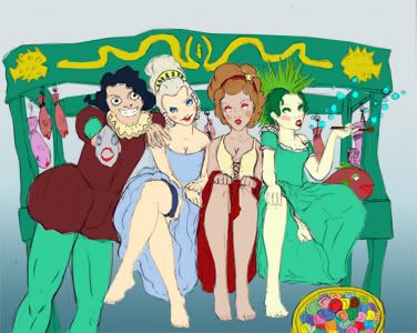
You, sir, are a fishmonger.

Polonius: Do you know me, my lord?
Hamlet: Excellent well; you're a fishmonger.


A much less glamorous way of calling someone a pimp, hah hah.

Photo Sharing and Video Hosting at Photobucket

And a 50% larger version. http://img.photobucket.com/albums/v294/WizardRin/largefishmonger.jpg

-Kathryn

Saturday, March 17, 2007

A very amusing idea.


"Dickhole" is a hilarious insult. More hilarious to me is the idea of Richard Nixon sitting in a hole wagging his jowls and barking at worms.

Final in gouache and all that.

Slutty Cum Dumpster


alright, I'm submitting this.. monstrocity. I dedided that I didn't want to draw people because a. thats what I always do, and b. this amuses me much more.
those are bits of clothing and used condoms/wrappers and such strewn around (In case its not apparant)
..yes.

Insults

"Riffraff," a fun word. It's maybe not that much of an insult?

Sunday, March 11, 2007

kerry cesen


alright, here's what i got so far....i think the spots are a little more cohesive and i'm satisfied on how the colors are working, any suggestions or concerns?